Six Directions in an Afternoon: Using Claude Design to Kill First-Instinct Bias
N=1 is a design quality ceiling
I spent three weeks stuck on what ÉLAN — my inspiration/journal app for creators — was supposed to feel like. Not stuck on features. Stuck on vibe. You open the app; what mood does it put you in? Film darkroom? Private journal? Gallery walk? I had opinions but no ability to test them, because in solo-dev reality, "test a direction" means "build a prototype," and that's a day of work per variant.
So I defaulted to N=1. Whatever my first instinct was on Tuesday, I coded. And whatever I coded, I kept, because I didn't have anything to compare it to. This is the design quality ceiling most solo dev products live under, and it's not a skill problem — it's a sample-size problem. You can't compare what you have with what you could have had.
Claude Design broke that ceiling for me. Six theme directions, each complete with color palette, typography, layout language, and phone screens, rendered in about twenty minutes. Not six variations of the same idea — six distinct visual languages.
This post is the pipeline I use, what it's actually good at, and how big-task's UI profile takes over once a direction is locked.
What Claude Design is
Not a separate product. Same Claude Code session, same model. What's different is the skill stack: design-consultation, design-md, frontend-design, and the impeccable:* family (animate, colorize, distill, extract, harden, normalize, onboard, polish, typeset, critique, bolder, quieter, delight). Different skills loaded, different instruction tone, different output.
The reason it feels like a separate tool is that the skill library is tuned for taste, aesthetic, and brand expression rather than throughput. impeccable:typeset will spend thought on tracking and font pairing in a way tdd-workflow will never spend thought on implementation detail.
The pipeline
Brief → six-direction exploration → analysis → converge to three → pick one → direction study → HANDOFF.md → big-task UI profile → ship.
Step 1 — Brief
One paragraph. What the product is, who it's for, what you want it to feel like. Not feature list. Mood, reference points, trade-offs.
For ÉLAN: "Inspiration/journal app for creators. Feel like a film darkroom — slow, intentional, tactile. Users 'develop' entries like film. The opposite of Instagram's infinite scroll."
One paragraph is enough. Claude Design will ask clarifying questions if it needs them.
Step 2 — Six-direction exploration
Claude Design emits six theme/aesthetic directions as phone mockups. Each direction has its own palette, typography, layout, and component language.
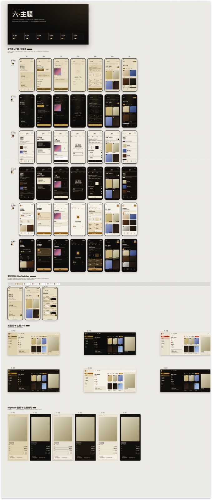 ÉLAN six-direction theme exploration — six distinct aesthetic languages rendered as phone mockups with their own color palettes
Half will be obvious misses for your brief. Half will have something. That's the math. N=6 gives a spread that N=1 can't. The variance across directions is the thing you pay for here — it's what forces you to see what's actually different between options.
Step 3 — Converge to three with analysis
Claude Design picks the three strongest and writes an analysis for each. What makes it distinct. Font + palette + interaction language. Trade-off.
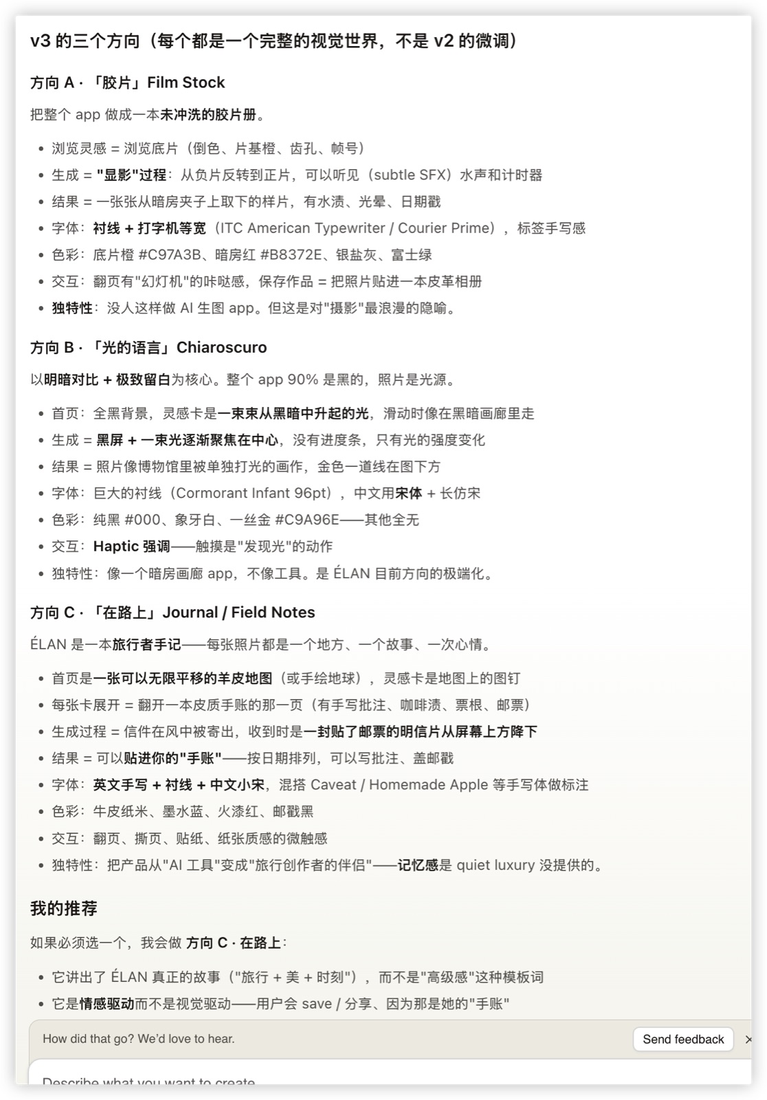 ÉLAN three-direction analysis — text breakdown of Film Stock (Direction A), Chiaroscuro (Direction B), Field Notes (Direction C) with typography, palette, interaction signatures, and trade-offs
This step is the part that saved me two weeks. When three competing directions each have their own voice, you're forced to see what's different about each, which is what lets you pick. The earlier phase (six directions) is for spread; this phase is for articulation.
The visual version of the three directions, side by side:
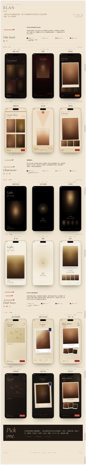 ÉLAN three finalist directions rendered as phone screens side by side — Film Stock, Chiaroscuro, Field Notes each with three representative screens
Step 4 — Pick (you, not the tool)
Claude Design can narrow six to three. It cannot pick between the three. That's taste, and taste is yours to exercise.
For ÉLAN I picked Direction A — Film Stock. Dark film-noir aesthetic, typewriter fonts, warm reds. It matched the "film darkroom" brief most literally, and the metaphor extended naturally: users have a "roll of film" they can "develop" to reveal entries, with a contact-sheet view and a darkroom aesthetic for the long-form editor.
I could have picked B (Chiaroscuro — light emerging from dark) or C (Field Notes — travel journal). Both were strong. Film Stock won because its metaphor most plausibly extended to every screen, which made me confident it wouldn't break down past the first mockup.
Step 5 — Direction study
Once picked, Claude Design expands the chosen direction into detailed screens. One direction, many screens, all visually coherent.
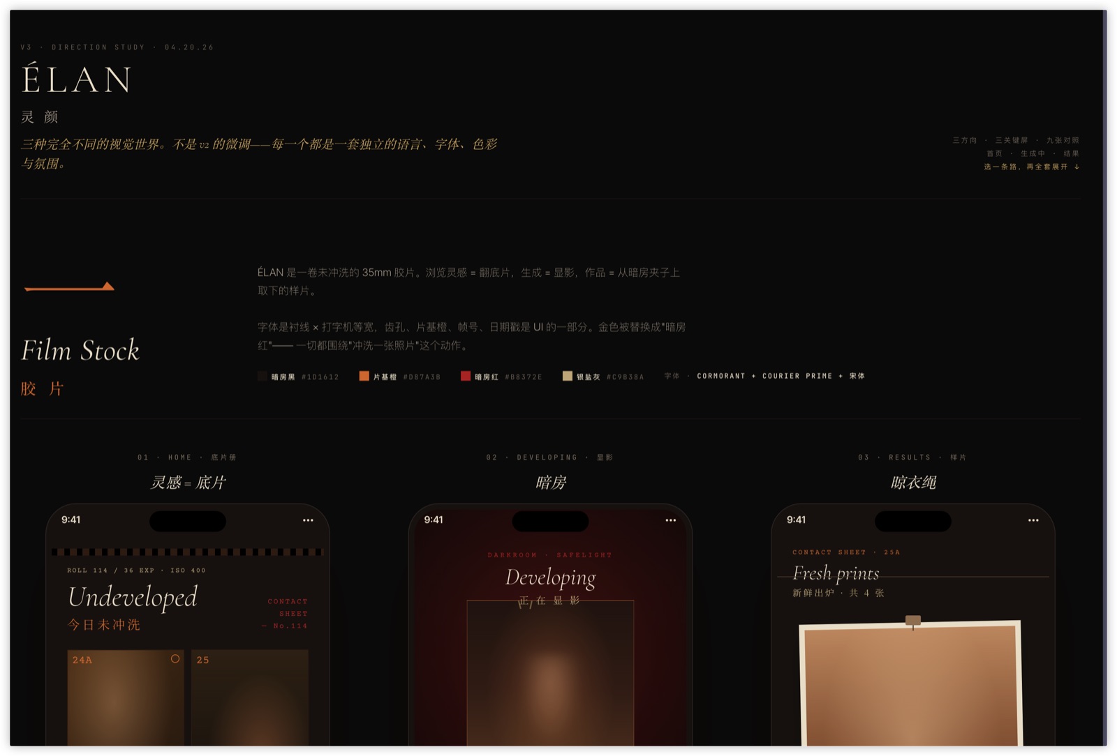 ÉLAN Film Stock direction full study — Undeveloped / Developing / Fresh Prints flow across three phone screens with Cormorant typography, film darkroom palette, and contact-sheet interaction
This is where you pressure-test the metaphor. Does Film Stock work for the settings screen? For the empty state? For error states? For search? If the metaphor breaks at screen 7, you'd rather find out now than after implementation.
For ÉLAN the metaphor held. Settings became "development preferences" (ISO, exposure). Empty states became "undeveloped rolls — shoot something today." Error states became "light leak — this roll was damaged."
Step 6 — HANDOFF.md
The lock. A single markdown file that captures the design system: typography scale, color tokens, component behaviors, motion rules, pixel-exact layouts for each screen. Plus directions/*.jsx — the reference screens as React components, checked into the repo.
This is the artifact that survives the handoff. Everything downstream — big-task UI profile, Playwright verify, code review — reads from HANDOFF.md and directions/*.jsx. They are the source of truth for "what does this screen look like?"
big-task takes over
When I open a session in the ÉLAN repo now, big-task's Phase 0.0 detects:
components-ui(components directory + Tailwind + Radix)design-ref(HANDOFF.md present)playwright(in dependencies)
→ auto-routes to ui-project profile. This forces Tier 3 GSD-lite, skips the full GSD ceremony (.planning/ meta-artifacts), and routes implementation through superpowers:subagent-driven-development with two-stage review.
Phase 2g — verify — is the part that matters for locked-design work. Because HANDOFF.md + directions/*.jsx + Figma PNGs exist, big-task mandates a visual verification pass:
- Boot dev server.
- Playwright screenshot sweep of every changed route × every theme variant → save to
docs/reports/{phase}-visual/. - Per-PNG parallel subagent dispatch. For ÉLAN's 12 routes × 2 themes = 24 PNGs, main thread doesn't touch the raw images. Each subagent reads
{screenshot_path, design_ref_path}, returns{route, verdict, concerns}≤200 tokens. - Main thread aggregates into a verdict matrix: PASS / FLAG / BLOCK per route.
BLOCK → fix task opened automatically. FLAG → surfaced to me with specific concern (spacing, color, alignment, missing element). PASS → no human spot-check needed.
The fidelity is high because the verifier agents compare pixels to the locked reference. Not "does this look good" (which LLMs will almost always say yes to), but "does this match the reference" — which they'll flag honestly when it doesn't.
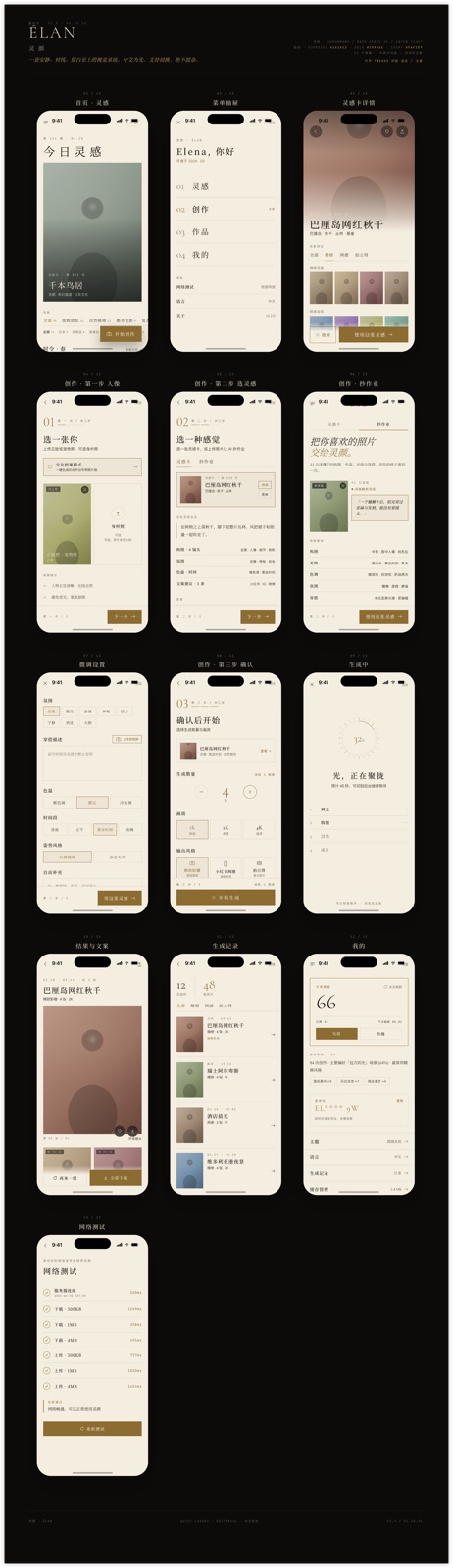 ÉLAN final implementation — Film Stock direction rendered as production screens, with Cormorant serif, warm reds on black, and the "develop / contact sheet / inspiration card" flow
What Claude Design is genuinely good at
- Widening the search space early. N=1 → N=6 is the cheapest win in the whole pipeline. The single biggest improvement to my design output this year came from this one step.
- Visual coherence within a direction. Given a theme, every screen produced after that point belongs to it. No stylistic drift.
- Machine-readable handoff. HANDOFF.md +
directions/*.jsxis a design spec you can lint, diff, and regenerate. Traditional design handoff lives in Figma/screenshots; this one lives in your repo and gets versioned with your code. - The polish layer.
impeccable:typeset,impeccable:polish,impeccable:animatehandle the last 20% (tracking, font pairing, micro-interactions) better than I do as a non-designer.
What it isn't good at
- Picking for you. It can narrow six to three. It can't tell you which of the three fits your brand. You still have to have taste.
- Genuinely novel aesthetics. Claude Design rearranges the design space it has seen. It won't invent a new visual movement. For most products that's fine; for a genuinely novel product aesthetic you'd still need a real designer.
- Vague briefs. The quality of the output is the quality of the brief, multiplied. If your brief is "make it look nice," you get six variations of "nice." If your brief is "film darkroom, slow, tactile, opposite of infinite scroll," you get six directions that actually explore that space.
What I'd tell you
If you're solo or small team doing UI work, the biggest lift in this whole pipeline is step 2 — six-direction exploration. It kills first-instinct bias by giving you alternatives cheaply. Everything downstream (HANDOFF.md, big-task UI profile, Playwright verify) is useful but incremental. Step 2 is the transformative one.
The cost is a good brief. If you can spend twenty minutes articulating what the product should feel like before step 1, you get twenty hours back in step 2.
References:
- Previous post in this series — harness iteration — for context on what
big-taskis and why Tier 3 GSD-lite exists. - ÉLAN product series: Building ÉLAN.